Pacman Font 1
Have you ever wondered about the fascinating history and design elements behind the Pacman font? We certainly have! Whether you’re a designer, typographer, or just someone who loves retro video games, understanding the Pacman font can be both intriguing and insightful. Let’s take a comprehensive look together.

What is the Pacman Font?
The Pacman font, as its name suggests, is inspired by the iconic typeface used in the original Pacman video game. Released in 1980 by Namco, Pacman quickly became a cultural phenomenon, and the font used in the game became nearly as iconic as the characters and gameplay itself.
Origin of the Pacman Font
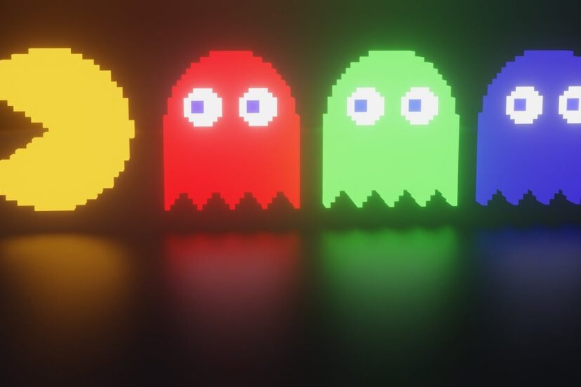
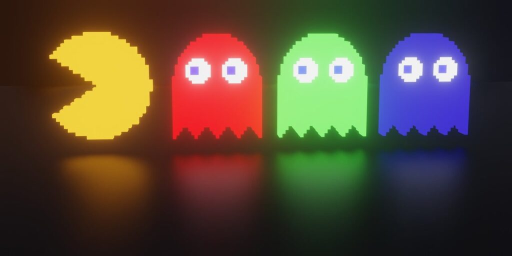
The Pacman font is a product of its time, reflecting the pixelated graphics of early arcade games. At its core, it captures the charm and simplicity of 8-bit graphic design. These limitations gave rise to a unique aesthetic that is instantly recognizable even today.
What Makes Pacman Font Unique?
This font stands out for several reasons:
- Pixelation: True to its 8-bit origins, the Pacman font is highly pixelated, offering a blocky, nostalgic feel.
- Boldness: The font features strong, bold lines, making it easily readable even on older, low-resolution screens.
- Cultural Icon: Beyond its design, the font carries with it a sense of nostalgia and cultural significance.
History of Pacman Font
Early Arcade Era and Typography
During the early 1980s, technology was rapidly evolving, but it was still very limited by today’s standards. Designers had to be creative within these constraints, leading to the kind of pixelated typefaces we associate with early gaming.
Influence on Later Gaming Fonts
The original Pacman font inspired many other fonts in subsequent games. These fonts shared the same characteristics of high readability and pixelation, and they continued to evolve as technology progressed.
Design Elements of Pacman Font
Structure and Symmetry
The Pacman font is designed with a high degree of symmetry and geometric form, which was essential for creating legible text on low-resolution screens. The blocky appearance, a constraint of early computing, has now become a stylistic choice.
| Element | Description |
|---|---|
| Symmetry | Ensures readability and visual balance. |
| Geometric | Simple shapes make up the characters. |
| Pixelation | Defines the retro, 8-bit aesthetic. |
| Bold Lines | Enhances readability on small screens. |
Color Palette
Though the font itself is typically monochromatic, often displayed in white or yellow on a black background, the game’s other design elements, including the colorful characters and maze, enhance its overall visual impact.
Usability
Pacman font isn’t just a relic; it’s still usable in various design projects today. Its retro look can complement modern designs, offering a nostalgic twist to contemporary user interfaces, posters, and other media.
Modern Uses of Pacman Font
Digital Media
From YouTube thumbnails to website headings, the Pacman font finds its place in various digital media due to its attention-grabbing and nostalgic qualities.
Print Media
Potential uses in print media include:
- Posters: Perfect for retro-themed events or exhibitions.
- Flyers: Grabs attention at a glance.
- Merchandise: Adds a nostalgic, playful touch to products such as T-shirts and mugs.
Branding
The Pacman font is also an excellent choice for branding purposes, particularly for products aimed at consumers who have a fondness for the 80s era.
How to Implement Pacman Font
Where to Find It
There are several online resources where you can download versions of the Pacman font, some of which are free to use:
- Google Fonts: While Google Fonts doesn’t host a specific Pacman font, it offers alternatives that are heavily inspired by 8-bit fonts.
- Font Squirrel: A resource for finding high-quality, legally embeddable fonts.
- DaFont: Known for its wide selection of free fonts, including retro gaming fonts.
Combining Pacman Font with Other Fonts
To create an effective design, consider pairing the Pacman font with more modern or minimalist fonts to balance the nostalgic look with contemporary aesthetics. Using contrasting fonts can help each element stand out.
| Pacman Font Component | Complementary Modern Font |
|---|---|
| Headings | Sans-serif like Arial or Helvetica |
| Sub-headings | Slightly decorative serif fonts |
| Body Text | Simple, readable sans-serif or serif fonts |
Tips for Effective Usage
When using the Pacman font, it’s crucial to maintain its legibility and ensure it complements rather than overwhelms other design elements. Here are some tips to keep in mind:
- Spacing: Make sure the text is appropriately spaced to retain its readability.
- Color Contrast: Use high contrast between the font color and background.
- Moderation: Use the font sparingly to maintain its impact without overwhelming the viewer.
Challenges and Considerations
Pixel Limitation
The pixelated nature of the Pacman font can be both a benefit and a limitation. While it offers a unique, retro aesthetic, it may not always be the best choice for text-heavy designs or where readability is paramount.
Cultural Relevance
While the Pacman font is highly recognizable and nostalgic for some, it may not have the same impact on younger audiences who didn’t grow up with the game. It’s crucial to evaluate the target demographic when considering this font for any project.
Licensing Concerns
Always ensure you check the licensing agreements related to any font you download, especially if it is for commercial use. Some fonts might have restrictions or require a licensing fee.

Future of Pacman Font
Revival Trends
Retro design trends periodically make a comeback, and the Pacman font finds its place in these cycles. As new generations discover vintage arcade games, the demand for retro-inspired designs continues to grow.
Digital Transformation
With the advancement in digital design tools and techniques, we might see modern iterations of the Pacman font, maintaining its iconic pixelated charm while adding new complexities.
Integration with Modern Technology
From Augmented Reality (AR) filters to Virtual Reality (VR) experiences, technology offers new platforms and mediums where the Pacman font can thrive. Imagine an AR experience that brings the nostalgic feel of the 80s arcade right into our living rooms.
Conclusion
The Pacman font is much more than just a collection of pixelated letters. It embodies an era, represents technological creativity, and continues to influence design in ways we might not have imagined. Whether we are nostalgic about the good old days of arcades or seeking a unique typeface for our next project, the Pacman font offers timeless appeal coupled with a rich history. By understanding its background, design elements, and potential modern applications, we can appreciate its enduring charm and relevance.

